Federal Agency for Education Russian Federation
Russian state professional
Pedagogical University.
Branch in Kemerovo.
Examination №2 on discipline: History and theory of design.
Theme: "Memphis" 80s design style.
Completed:
Checked:
Kemerovo 2006.
1. Introduction 2
2. Ettore Sottsass 3
3. Andre Branzi 5
4. Michele de Luca 7
5. Memphis 10
6. Conclusion 16
7. Literature 17
INTRODUCTION
No matter how much time passes; days, years or centuries, the craving for beauty in a person will never die. Man at all times, from ancient times to the present day, sought to decorate himself and everything that is around him. Hence, such a direction as design arose, which affected all spheres of human activity. Many discoveries have been made and many beautiful things have been created. The history of design is full of great names. But today I want to consider the time period that fell on modern history- 80s of the XX century.
The 80s became a period of new discoveries and a revision of views on the cultural life of society. But this time was especially remembered for the spirit of rebellion that reigned everywhere. Everything that was traditional was rejected. It was replaced by an unconventional, "frivolous" attitude to the world. In interior design, such a direction as "Antidesign" appeared; "Boring" functional objects were replaced with bright colorful things that were pleasing to the eye and, at times, did not even carry any functional load. Dark colors gave way to light and pastel colors; rooms furnished with heavy furniture have been replaced light air space with the minimum amount items (such as high-tech style). However, among all this splendor, a style with the mysterious name "Memphis" swept through in a separate unique and unforgettable wave. It is to this style and its creators that my test. After all, without a concept of this style, our knowledge of the history and theory of design will be very incomplete.
EttoreSottsass
The colorful history of the Memphis style began with a man named Ettore Sottsass.
Ettore Sottsass was born in Innsbruck (Austria) in 1917 in the family of the elder architect Sottsass. He then studied architecture at the Turin Polytechnic Institute, receiving his degree in 1939. However, between 1939 and 1946 he was cut off from his professional environment by war and captivity. He managed to resume his career in Milan in 1947. After returning to work, Ettore's interests included architectural and industrial design, ceramics, Jewelry as well as graphic design. By the end of the 1950s, he was already the author of many projects in these areas.
Sottsass is actively looking for new ways of shaping. At the same time, he refuses both the style of "classical" design and functionalist schemes, trying to develop his own design style, his own ideology.
In 1962, Sottsass published an article "Design" in the Domus magazine. The main idea of this article was that design as such does not deal with the function and rationality of a thing, but with the environment, with the cultural atmosphere in which the object is immersed. The thing is perceived rather as a magical object, but not as an instrument for performing any function. Hence - "meditative design", spontaneity, the author's gesture - Ettore's design style.
Thanks to his innovative ideas, by the beginning of the 60s, Sottsass was gaining wide popularity in the alternative design environment. But at the same time, Sottasass is gaining a reputation as a “serious” industrial designer - in particular, with his projects for the Olivetti company (Elea-9003 electronic computing system, Praxis-48 and Tekne-3 electric typewriters) .
At the same time, he does not leave his search in an alternative direction. So, based on them, Ettore creates a series of monumental ceramics and furniture for the firms Poltronova, Menhir, Ziggurat and Stupa.
Such a combination, it would seem. incongruous things was a hallmark of the designer. The duality of Sottsass has become the main source of myths about him. An incredible combination of rebellion and professionalism, passion for mysticism and hyperfunctionality of projects. In the late 60s, he becomes a kind of guru for the rebellious young designers.
Its duality is a source of creative freedom, numerous intertwined threads of interconnections stretch between the polar signs of an industrial design professional and a leader of an alternative design culture. In 1969, Sottsass designed the Valentina portable typewriter for Olivetti.
Thanks to his vision, a technically complex product was put on a par with simple household items: a bag, clothes, a trinket. The machine was made of bright red cheap plastic in combination with active yellow bobbins, thus turning from a tool into a tool for creativity. Even in the technical industrial facility, the style of pop culture has taken root. However, at the same time, in his conceptual alternative projects, Ettore began to use the principle of "neutral" design, which is natural for industrial facilities where function is primary.
In 1972, Sottsass designed the futuristic "Container Dwelling" - a combined system of multifunctional plastic modules. And for Olivetti, he creates office equipment systems. A unified office environment is being designed, including furniture, appliances, office supplies and even architectural details of the layout.
It seemed that he had achieved everything one could dream of: fame, recognition, money. However, Sottsass was not going to stop there. Ettore went further, founding his own design movement, the Memphis style.
ANDRE BRANZI
Ettore Sottsass was undoubtedly the founder of the Memphis movement. However, his activities would hardly have been so fruitful without his associates - Michele de Luca and Andre Branzi.
Andre Branzi is an Italian architect and designer, one of the leading design theorists. Born and educated in Florence, he currently lives and works in Milan. At the time of the meeting with Sottsass, Andre was no longer a novice in his field. Since 1967 he has worked in the fields of industrial and research design, architecture, urban planning, education and cultural support. Branzi's field of activity includes architectural projects, industrial and experimental design, urban planning, journalism in the field of design theory, and critical literature.
Like Ettore, he became one of the founders of the "Archizoom" association, the ideology of "radical movement" and "new design". In the 1960s - 70s. gg. he creates a number of concept projects within the "Archizoom" group under the motto "to inhabit is easy". It is to this period of life that Andre refers his, in his opinion, the most significant project "no-stop city" (1970), developed by members of the Archizoom group. This project was utopian concept a city presented as a huge organism, created more according to the rules of the Internet than according to the principle of a classical city. According to the designer himself, this project "was very important for me and my generation, for many artists who appeared later."
In addition, Branzi participated in the creation of the school of radical architecture and design "Global Tools" (1973), the purpose of which was the development and study of non-industrial methods of production, the promotion of individual creativity (which largely echoes the ideas of William Morris). In 1973, he created with colleagues an experimental design - the CDM bureau, which was engaged in the creation of the so-called primary design.
In 1973 André opened his studio in Milan, in the early 1980s he exhibited with his studio Alchimia, which was organized as a gallery of experimental works not intended for industrial production. And in 1977, together with Michele de Luca, he founded the famous exhibition "Il Disegno italiano degli anni 50". In 1981, Andrea Branzi took part in the founding of the Memphis group, which was originally created as a branch of the Alchemy studio. However, unlike Alchemy, Memphis focused on mass production.
At the same time, he collaborated with the leading manufacturers of furniture and accessories in Italy and abroad (Artemide, Cassina, Vitra,
Zanotta), the most recent of which was Alessi. Andre's creed was the words: "Design should be everything." Branzi's creative approach is characterized by an openness to research and experimentation. When creating his design, he pays special attention to materials, as well as the symbolic meaning of objects.
Branzi participated in editions of the Milan Triennial and the Venice Biennale and held solo exhibitions in various international museums, including the Museums of Decorative Arts in Montreal and Paris, at the scharpoord centrum knokke and at the fondation pour l'architecture in Brussels.
Collaborated with the magazines "Interni", "Domus", "Casabella". From 1983 to 1987, he was the editor of Modo magazine.
Today Andre Branzi is the head of the Domus Academy and is a professor of industrial design at the Politecnico di Milano. Exhibitions of his work are held both in Italy and abroad.
Michele de Luchi
The story would not be complete if I did not mention another member of this creative union - Michele de Luca.
Michele de Luchi is a well-known Italian designer and architect, a prominent representative of the eighties generation.
Michele de Luchi was born in Ferrara. He was educated at the University of Florence. Currently lives and works in Milan. belongs to that generation. Designers whose professional career is closely connected with the emergence of "new design".
- a total return to the aesthetics of the 1980s. Bright color, flat designs and lots of angular geometry. For many designers, the 80s are a flashback to their youth, so this trend is completely two-channel. That's why the 80s style took off again, and in our review there are several ways to help you use this trend.
1) Everything new is a well-forgotten old
As upsetting as it is for the kids of the 80s, this era is already officially considered retro. To make this realization a little less painful, let's call this decade "modern retro."
This "old" style is distinguished by elements designed for early low-resolution screens. It uses design elements that take us back to the nostalgia of early Nintendo gaming systems, proving the popularity of pixel art and poster art.
The old new style includes 80s charm plus everything you want to implement on a website today, with great animation and easy to read typography. Look, for example, at The Vinyl Lab website. It greets you with an 80s aesthetic, but as soon as you scroll through the site, it feels completely modern and works equally great on phones and smaller devices. Is this a new or old design? You decide.
2) Patterns and shapes that provide visual interest

Geometric shapes and fun patterns can give a design exactly what it needs – a shift away from the minimalism that was so popular until recently to a more imaginative aesthetic.
Your visual style will help determine which option is best:
Using a pattern if the design is clean and organized and something in the background won't interfere with the content
Using geometric shapes to add a bold pop of color to an overall design if it seems a bit dull. Caava Design, in the example below, uses colorful geometry in a very inspiring way.
3) Fashion influence

W Magazine predicts the style of the 80s as one of the biggest trends in fashion.
Before you roll your eyes and ask: what does fashion have to do with it? - listen to our arguments. Regardless of the type of design - whether it's fashion, art, interior design or website development - each genre influences the other.
So, how will the long hair and leggings so popular in the 80s affect websites. Elements of the 80s can appear in the clothing of the people in the photographs. And to balance the imagery, you might have to use oversized typography to make up for the model's super-sized hair.
Textiles can also be an indicator of visually pleasing elements. If people buy neon orange shirts or pants with bold patterns, they won't find flashy design elements offensive, and even vice versa, they will subconsciously look for them on websites.
4) Neo Memphis is gaining momentum

The design in this style is packed with bright color and lots of shapes and lines. The authors of this aesthetic model is the Memphis Group - a bunch of interior designers who worked in the 1980s.
The Memphis style is really flat with vectorized elements in an almost cartoonish style. Often elements are layered on top of a white (light) or black (dark) background, creating a sharp contrast between them. This style is bright and cheerful, attracting attention.
5) Space and darkness are intriguing

The 80s were characterized by the use of artistic images using neon on a dark background and space motifs.
Space is still a dominant theme in design, and many space projects have a nostalgic feel to the 80s era. The TV show Mars in the example below uses this idea with a dark background, bright logo and 3D style lettering.
6) Influence of flat design

Flat design was popular in Lately, so its shift to the aesthetics of the 80s is quite natural. It's a kind of natural evolution - when modern trends are combined with a retro concept.
The 80s themes combined with modern elements create a feeling of a bygone era, but with a user interface that modern users expect to see.
7) Total use of iconography

Many design styles from the 80s included cute little icons. Tiny palm trees and sunglasses on shirts, squiggles and lines on laptops - the iconography marks the resurgence of the 80s. With so many icons imitating handwritten elements, iconography can be classed as an art form in its own right. Icons can provide more flexibility for projects that lack other visual effects and help visually organize content.
Here is an example of using 80s style iconography: lots of small icons in different places, often in random order.
8) Juicy color on the screens

Bright color schemes are growing in popularity, another trend that is associated with flat design. It seems like a natural response to all those black and white palettes that dominated during the high phase of minimalism. The shift towards color allows developers to play more and more with design, showing creative freedom.
In conclusion….
One of the most big reasons return to the aesthetics of the 80s - pop culture leaking to us from the past. Maybe it's nostalgia that overtakes every generation, maybe it's a natural cycle of styles. One thing is for sure: if you see the influence of the 80s in fashion or music, it will definitely cover web design. Don't resist - just enjoy the trend. The 80s were fun and nonchalant - and your modern retro design should reflect that.
Let's create something cool together!
![]()
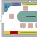
The style of the eighties is not at all simple. In those days, it very quickly outlived its usefulness, because such an interior was made in bright colors with large figures, which does not allow the eye to relax and causes an excited state. However, these days, the mischievous style of the 80s, where each item is filled with its own functional load, has become very popular. This style, with its originality, seems to be trying to show us that we should not take things too seriously, because our whole life is a game.
To create an interior in the style of the 80s, you need to know a few nuances. In those years, preference was given to brilliant colors, shades of green, yellow, orange, turquoise. At the peak of fashion there were large patterns, for example, rhombuses, stripes or peas of various sizes. Bright textured wallpapers were in fashion, especially plain ones with various shapes. For example, one wall can be decorated with circles, the other with pyramids, the third with rectangles, and the fourth can be just plain, only with a window located in it. You can lay a laminate on the floor, which must be covered with a carpet, for example, of a dark chocolate shade. This will make the room more comfortable. It is important to lay the carpet in such a way that the guests, gathering at the table, can put their feet on it.
In the eighties, every house had a sideboard, and each sideboard of that time was similar to each other. Sideboards stored dishes, some of them had a department similar to a bar, in which various little things could be stored. In those days, it was especially chic to have a wall cabinet - a set of cabinets that fit snugly against each other and performed different tasks. Satisfied owners of such a powerful piece of furniture thought that they had not lived their lives in vain. The fashion of the wall in the eighties can only be compared with the explosion of popularity of jeans in the seventies.
If you want to recreate the interior in the style of the eighties, then you will need to purchase a wall only to order. Perhaps it will be an improved copy of the wall that was in your distant childhood - with facades made of laminated MDF and having glass inserts and shiny handles. On the glass shelves of such a sideboard, you can put collectible porcelain dishes, if you have one, in addition, you can put modern dishes of bizarre shapes and colors. In this case, a kind of eclectic action will arise, and the old form will acquire a new, already modern meaning. In sideboards, dark-colored square-shaped dishes or dishes painted with bright interesting patterns will be appropriate.
Another obligatory element setting of the eighties is a dressing table. It can be placed in the hallway or bedroom. It is imperative to put a tall floor lamp, which will be decorated with fringe and create a seating area in the evening, when there is no more daylight.
Upholstered furniture in the style of the eighties should be quite bulky and be sure to have comfortable deep seats, wide armrests and legs that are either high or almost invisible.
Sofas and armchairs of those distant years were made of iron and wood, and the upholstery was made of tapestry or leather substitutes.
The main elements of decor in the eighties were glass and mirrors. Especially chic was the decoration of mirrors and interior doors glass and very different patterns with inlays. The drawings looked so touching and gentle, like a beautiful icy hoarfrost in the winter. Unlike boring film-tinted glass, which is very common in the interiors of our time, sandblasted glass will help to create a special atmosphere of durability and authenticity in the interior.
The walls in the eighties were decorated with enlarged photographs, which were decorated with a passe-partout. Artistic portraits of family members look especially advantageous and impressive - black and white, autumn-winter landscapes, photo-industrial themes. Frames of various sizes can be hung both on one wall and on the walls of the entire room.
If you decide to recreate an interior in the style of the eighties at home, then you should not try to reproduce it in all the smallest details. Do not follow this rule and your interior will not look banal and limited! It is possible, and even necessary, to create a familiar form, however, filled with completely new content. Today we are unlimited in the possibilities of choosing interior items, and this is what allows us to recreate the bright and energetic style of the eighties, we can present this style in a completely new way, trust our imagination and present it the way we wanted to see it in our youth and childhood! You need to add air, breadth, more space to this style, and it will become truly amazing, chic and modern. After all, if we talk about what constitutes the style of the eighties, then this is undoubtedly urban chic!
The history of communal apartments began at the moment when Soviet authority came up with the idea to settle in large multi-room apartments middle class pre-revolutionary Russia proletariat. In the first years of its existence, the Soviet government, which had promised to give factory workers, became convinced that it was not even in a position to provide them with separate housing. The problem became especially urgent in large cities, the population of which grew at a rapid pace.
The Bolsheviks, with their characteristic penchant for simple solutions, found a way out - they began to settle several families in one apartment, allocating each a separate room with a common kitchen and bathroom. So the process of creating communal apartments was launched. Completely different people, often entire families, settled in an apartment consisting of several rooms. Accordingly, they had a room and a shared kitchen and bathroom.


Neighbors in communal apartments - people of different social status, vital interests and habits - lived in one place, intertwined destinies, quarreled and reconciled. “The relationship between the residents of the communal apartment, as a rule, was tense: everyday difficulties embittered people,” writes writer Lev Stern in his memoirs about Odessa. “If sometimes you had to wait in line for a toilet or a tap for a long time, it is difficult to expect warm relations between neighbors.”

As a rule, communal apartments were organized in tenement houses - high-rise buildings royal buildings, erected by the beginning of the twentieth century in large cities. The communists set out to densify the population of these "bourgeois" nests as soon as they established control over the cities. “It is necessary to compact the dwellings, and in view of the lack of dwellings, we will resort to the eviction of those elements whose stay is not necessary,” wrote the Kiev Communist newspaper on February 19, 1919, two weeks after the second attempt by the Bolsheviks to gain a foothold in Kiev. On behalf of the new government, the newspapers informed readers that "loafers, speculators, criminals, White Guards, and other elements, of course, must be deprived of apartments." In addition, in Soviet apartments, as it turned out, there should not be living rooms, halls and dining rooms. The Bolsheviks promised to leave the offices only to those who needed them for work - doctors, professors and responsible workers. As a rule, one or two floors were vacated for the new bosses. Former tenants and owners were placed in the same buildings, offering to release the square meters allocated for the needs of the government within 24 hours. Only the bed and essentials were allowed to be taken with them.

The picture of K. S. Petrov-Vodkin “Housewarming” (1918) is indicative:

It shows in some detail the clash of the old aristocratic life and the representatives of the working people who moved to an unconventional home for them, the new masters of life. A large hall with a parquet floor, on which the new tenants have laid out village paths, next to a huge mirror and oil paintings hung on the walls in gilded frames, stools are placed mixed with carved chairs. Household items of opposite social strata conduct their own silent dialogue, echoing the realities of social life.

Literally a couple of years after the former tenement houses received new tenants - small-town proletarians who massively rushed after the revolution to big cities, the authorities were faced with an unexpected problem: sturdy-looking housing, built of stone and brick, began to quickly become unusable. The poor, who ended up in the "master's mansions", did not appreciate them too much, because many newly-made tenants not only received housing for free, but at first were exempted from paying rent. The "proletariat" quickly finished off the sewers, plumbing and stoves. Garbage began to accumulate in the yards, which no one took out. And devastation set in, just like according to Bulgakov.

The fact that the apartment was a communal one could be seen even from the threshold - near the front door there were several call buttons with the names of the heads of families and an indication of how many times to call whom. All common areas - corridor, kitchen, bathroom, toilet - also had a few light bulbs, according to the number of families (no one wanted to pay for electricity used by a neighbor). And in the toilet, each had its own toilet seat, hanging right there on the wall. Common areas were cleaned on schedule. However, the concept of purity was relative, because each of the users had their own idea of it. As a result, fungus and insects have become constant companions of communal apartments.
.jpg)
This Soviet housing know-how for many years determined not only the life of the citizens of the USSR, but also became part of the urban subculture. Housing, conceived as temporary, managed to survive the Union.

The action of some Soviet films takes place in communal apartments. Of the most famous: "Girl without an address", "Pokrovsky Gates", "Five Evenings".

Stalin's apartments 1930-1950s
After the cessation of 15 years of experiments to create a new aesthetics and new forms of dormitory in the USSR since the early 1930s, an atmosphere of conservative traditionalism has been established for more than two decades. At first it was "Stalinist classicism", which after the war grew into "Stalinist Empire", with heavy, monumental forms, the motives of which were often taken even from ancient Roman architecture.


The main type of Soviet housing was declared an individual comfortable apartment. Stone, eclectically decorated houses with rich apartments by Soviet standards (often with rooms for housekeepers) were built on the main streets of cities. These houses were built using high quality materials. Thick walls, good sound insulation along with high ceilings and a complete set of communications - live and enjoy!


But in order to get such an apartment in such a house, one had to be in the “cage”, or as it would be called later, to be included in the nomenclature, to be a prominent representative of the creative or scientific intelligentsia. True, it should be noted that a certain number of ordinary citizens still received apartments in elite houses.
What the apartments of the 50s were like, many people imagine well from the films of those years or from their own memories (grandparents often kept such interiors until the end of the century).

Stills from the film "Moscow Does Not Believe in Tears", the film was released in 1979, but it accurately, to the smallest detail, conveys the atmosphere of those years. First of all, this is a chic oak furniture, designed to serve several generations.

Those who were richer were forced to collect collection porcelain from the Leningrad factory. In the main room, a lampshade is more often cheerful, a luxurious chandelier in the picture gives out a rather high social status of the owners.

The interiors of Stalinist apartments can also be seen on the canvases of artists of those years, painted with warmth and love:


A real luxury for the 50s was your own telephone in the apartment. His setup was important event in the life of the Soviet family. This photo from 1953 captures just such a joyful moment in one of the Moscow apartments:

Sergei Mikhalkov with his son Nikita, 1952

In the mid-1950s, television gradually began to enter the life of the Soviet family, which immediately took pride of place in the apartments.

In this new apartment the interiors are still pre-Khrushchev, with high ceilings and solid furniture. Pay attention to the love for round (sliding) tables, which then for some reason will become a rarity with us. A bookcase in a place of honor is also a very typical feature of the Soviet home interior.

In the late 1950s, a new era would begin. Millions of people will begin to move into their individual, albeit very tiny, Khrushchev apartments. There will be completely different furniture.
Khrushchev
1955 was a turning point, since it was in this year that a decree on industrial housing construction was adopted, which marked the beginning of the Khrushchev era. But in 1955, more "malenkovkas" were built with the last hints of the quality factor and the architectural aesthetics of the "stalinok". Stalinka could not be enough for everyone, by definition ...


The construction of houses - "Khrushchev" was started in 1959, and completed in the eighties. Usually in the apartments of such houses there are from one to four rooms, which would be more suitable for the name "cells". But Khrushchev, no matter how you scold it, became the first dwelling for the people in the post-revolutionary years.

housewarming

In a new apartment. Personnel worker of the plant "Red October" Shubin A.I. Moscow, Tushino, 1956

Furniture from the 60s-70s can still be found in old apartments, but most of us do not remember what a real average apartment interior of the late 60s and early 70s looked like, even before the period of imported walls and our cabinet furniture. And, nevertheless, to look at the interiors of these apartments is very interesting. Let's go back 40 years and look at a typical Soviet-era apartment of a middle-class family. Let's look into the living room of the 60s - 70s. So, let's start with the sideboard, which came into vogue in the 60s and replaced the sideboard.

The design of the sideboards was the same, its surface was polished, according to the fashion of that time, the glasses were sliding. And they all differed in one feature - it was very difficult to open the sideboard glass. This miracle served for storing dishes and souvenirs.

Another such a cute set, I know that many people still keep it as a family heirloom:

From the sideboard, we glance at the armchairs and the coffee table. Armchairs, well, what can I say about them. Only the fact that they were comfortable, with upholstery often quite poisonous colors - and pleasing to the eye and comfort created.

Considering that in our apartments of those years, the living room was most often combined with the bedroom of the parents, many of them had a dressing table. An indispensable piece of furniture that every Soviet woman dreamed of. And today, many still remember the old Soviet furniture and even still use sideboards, cabinets and shelves made in the USSR. Against the background of the current abundance, these polished monsters seem even uglier and antediluvian.

Such carpets were often hung on the walls of living rooms, bedrooms:


And this is what the kitchen looked like and no furniture for you:

barrack
And now let's see how and in what conditions 80% of the population of the USSR lived before the start of Khrushchev's industrialization of construction. And do not hope, these were not pretentious stalins of different periods, and not at home - communes, and the old fund was not enough for everyone, even when taking into account resettlement in communal apartments. basis housing stock at that time there was a peat-filling hut ...

Each of the factory settlements consisted of several capital stone buildings and many wooden barracks, in which the overwhelming majority of its inhabitants lived. Their mass construction began simultaneously with the construction of new and reconstruction of old plants during the first five-year plan. A barrack is a quickly built and cheap dwelling, built with disregard for service life and amenities, in most cases with a common corridor and stove heating.

A room in one of the barracks in Magnigorsk

There was no water supply and sewerage in the barracks; all these "amenities", as they say, were located in the yard of the barracks. Barracks construction was considered as a temporary measure - the workers of the new giants of the industry and the expanding production of old factories had to be urgently provided with at least some kind of housing. Barracks, like hostels, were divided into men's, women's and family-type barracks.


For a modern city dweller spoiled with comfort, this housing will seem completely unsatisfactory, especially considering that the barracks were already overcrowded in the 1930s, and in the harsh military 1940s, the situation worsened even more due to evacuation. Barak did not expect the opportunity to retire, to sit quietly at the table with his family or with his closest friends. The physical space of the barracks formed a special social space and special people who inhabited this space. But even such housing, people sought to equip in the best way possible, and create at least some semblance of comfort.

In Moscow, such houses existed until the mid-70s, and in more remote cities in such houses, thoroughly dilapidated, people still live.

New apartments 70-80s
Houses - "Brezhnevka" appeared in the Soviet Union in the seventies. Usually they were built not in width, but in height. The usual height of the "brezhnevka" was from nine to 16 floors. It happened that even taller houses were erected.


Houses - "Brezhnevka" without fail equipped with an elevator and a garbage chute. The apartments were located in the so-called "pockets", in each such "pocket" there were usually two apartments. The original name of "brezhnevka" was "improved planning apartments". Of course, compared to the Khrushchevs, such apartments actually had an improved layout, but if we compare them with the Stalins, it would be more accurate to call them a “worse version”. The size of the kitchen in such an apartment is from seven to nine square meters, the ceilings are much lower than the "Stalinist" ones, the number of rooms can be from one to five.


So, entering a typical apartment of the 70s, we could see an interior consisting of a sofa and a “wall” opposite, two armchairs and a coffee table, a polished table - and everything is arranged the same for everyone, because The layout left no room for imagination. It meant life was good...

Imported walls were especially valued, from the CMEA countries, of course. They saved up for a long time on the wall, signed up for a queue, waited a long time and finally found the coveted “GDR”, Czech or Romanian headsets. I must say that the prices for them were quite impressive and reached 1000 rubles with an average salary of an engineer of 180-200 rubles. In many families, the purchase of imported furniture was considered a very good and practical investment of money, they were bought as a legacy for children, that is, for centuries.

These walls sometimes occupied almost half the room, but it was impossible not to have it, because it somehow imperceptibly passed from the category of cabinet furniture into the category of an object of prestige. She replaced several types of furniture and gave impetus to the emerging fashion for collecting crystal, books, etc. Shelves with beautiful glass doors had to be filled with something!

All self-respecting housewives acquired crystal dishes. Not a single dinner party was complete without a sparkling in the light crystal glass, crystal vase or bowl. In addition, crystal was considered an ideal option for investing material resources.

Another obligatory item in the interior of those years is a sliding polished table.


Of course, carpets were part of the interior of a Soviet apartment. They made an inseparable pair with crystal. In addition to aesthetic value, the carpet on the wall also had a practical one. It performed the function of soundproofing the walls, and in some cases also covered the defects of the wall.

An invariable attribute of the living room: a three-tiered chandelier with plastic pendants:

Transforming furniture with multiple functions was very popular. Most often, beds were transformed, which could turn into armchairs, beds, sofa beds, as well as tables (cabinet-table, sideboard-table, dressing tables, etc.). For many families, this has been a lifesaver. Sometimes, the living room in the evening turned into a bedroom: a sofa bed, armchair beds. And in the morning the room again turned into a living room.
Scenes from the film "Moscow Does Not Believe in Tears". Such an interior in the 80s in the USSR was considered simply aerobatics.

And such an interior as in Samokhvalov's apartment in the film "Office Romance" was also the envy of ordinary Soviet citizens.

Perhaps fifty years from now, our current homes will also be the object of curiosity for future generations, with the inevitable pros and cons. But this stage is necessary for our future, just as the past aesthetics of the Soviet apartment was necessary for the perception of our present.
Source http://www.spletnik.ru/
post-industrial society. The term "post-industrial society" was born in the United States at the turn of the 50s and 60s. it was used in his lectures by the American sociologist Daniel Bell. Since the late 60s, the theory of a post-industrial society has begun to develop, the hallmarks of which are called the mass distribution of creative, intellectual labor, a qualitatively increased volume and significance scientific knowledge and information, the development of means of communication, the predominance of the service sector, science, education, and culture in the structure of the economy. Post-industrial society is beginning to be regarded as a qualitatively new stage in the development of not only the West, but of all mankind. The authors of the theory of post-industrial society note that in the coming century for economic and social life, for the methods of production of knowledge, as well as for the character labor activity development of a new social structure based on telecommunications will become decisive.
The formation of a post-industrial society is associated with an unfolding revolution in the organization and processing of information and knowledge, in which the computer plays a central role. The computer is a symbol and at the same time a material carrier of the technological revolution. It is the computer that radically transforms society in the second half of the 20th century. Thus, a key role in the new society is assigned to information and electronic means that provide technical base for its use and distribution. In this regard, the term "information society" has become widespread, duplicating the concept of "post-industrial society", and is used to denote a civilization, the development and existence of which is based on a special substance called "information", which has the property of interaction with both the spiritual and the spiritual. and with the material world of a person and, thus, determining both the sociocultural life of a person and his material existence.
From modernity ("modern movement") to postmodernity. Critical of the purism of the "modern movement" of pop culture, the various currents of radical design in the 60s, widely supported by the media, were becoming more widespread. At the same time, Germany continued to award the federal "Good Form" award to modernist works, thereby continuing to support the aesthetic values of industrial society. Thanks to such a variety of aesthetic trends in art and design, the consumer's taste has expanded, a versatility of perception and pluralism of aesthetic views have been formed: stylistic trends have been added to the only direction that existed before "good design". Society in the late 70's - 80's. a complex sociological structure was formed, which was almost impossible to clearly divide into middle, lower and upper classes. Taste and style in different segments of the population was also multifaceted.
This pluralism of aesthetic views and opinions became a social phenomenon in the 1970s, which eventually led to the emergence of a new artistic style, in opposition to the "modern movement", called "postmodern". Postmodernism destroyed the postulate "form follows function" and stopped categorically dividing design into "bad" and "good", into "good form" and "kitsch", into "high culture" and "ordinary".
Beginning of postmodern. Postmodern has its roots in pop culture and radical design trends. The very concept of "postmodern" in architectural theory began to be used from the beginning of the 70s. In 1966, Robert Venturi's book "Complexity and Contradictions in Architecture" was published in the USA, where he formulated the theses of anti-functionalism, and it became known as the "bible of postmodernism". However, in a broader sense, this concept began to be used after the publication of Charles Jencks' book "The Language of Postmodern Architecture" (1980).
In artistic shaping, postmodernism turned, as opposed to monochrome, rational forms and dogmas of the "modern movement", to decorativeness and colorfulness, kitsch and chic, individuality and figurative semantics of elements, and often irony, to quoting historical styles. Postmodern architects and artists used quotes not only from past styles - classicism, art deco, constructivism, but also from surrealism, kitsch, computer graphics. Jenks attributes the "retro" tendencies and the use of historical quotations to the deep disillusionment with "modern movement" architecture in the 1970s. in the professional and broad public consciousness, the emerging trend of "nostalgia for the past." The "golden age" was increasingly seen in the past as the antithesis of modernity.
Postmodern as an international style. In the 70-80s. ideas about the postmodern were far from unambiguous. There were debates about whether postmodern is a new independent stylistic direction in design, or is it a return to the "modern movement" and its development at a new stage. In Italy, for example, the Milanese groups "Alchemy" (mid-70s) and "Memphis" (early 80s) were representatives of postmodernism. Historical forms, a popular cultural line, and eclectic motifs can be traced in their works. At the same time, "Memphis" preferred the name "New International Style" to the concept of "postmodern". Despite the existing discrepancies in the term "postmodern", an international style clearly loomed in architecture and design.
Postmodern has created a new concept of design as consumer-oriented design. Without postmodernity at the end of the 20th century, the subsequent search for a bright and meaningful design with a new meaning and ecological morality would not have been possible.
The monumentality of "architecture as art" was replaced by business-like neutrality. The load-bearing steel structures placed outside the outer fence form a kind of scaffolding, in which communications and networks of engineering equipment run. The metaphorical attributes of technology here lead to the demystification of the social function: the center of the arts is presented as a kind of complex device that ensures everyday communication and consumption of information. Behind this is a reflection of the sardonic metaphors of pop art and the absurd car. The negative charge transforms architecture into anti-architecture.
"Hi-tech" in design. Along with high-tech architecture, the design of the living environment has been conquering since the late 70s. His main method here is the use of industrial equipment. The residential interior is often seen as an ensemble of things made for other purposes. Experiments in this direction have an economic connotation: on the one hand, in the face of growing financial difficulties, middle-class people are looking for ways to build houses using the "do it yourself" method, sometimes turning to unexpected means; on the other hand, this need is artificially stimulated by the advertising of industrial firms seeking to find new markets for their products.
"Hi-tech" promotes the introduction of furniture in housing from standard metal elements produced for racks in factory warehouses or locker rooms in "change houses". Bus, airplane and even dental chairs began to be introduced into the furnishings of dwellings, and laboratory glass was used as household utensils. The latest industrial materials and prefabricated elements were introduced into high-tech object design. In the shaping of furniture and other design objects or used technical details from the military or scientific fields of electronic technical equipment. Classical examples of "hi-tech" in object design are Norman Foster's "Nomos" stationery furniture system (1987) and Mateo Thun's container cabinet (1985).